React Status Gauge is a lightweight and fully customizable semicircle gauge component for React built with SVG.
It is perfect for dashboards, KPI cards, status indicators, and any React project that needs a clean and animated gauge UI.
If you were thinking about donating, the best way to support me for now is to follow me on GitHub and star this project.
It really helps me keep building and improving open-source components.
- Follow me on GitHub
- Star this repository
If you're searching for a React gauge component with a clean semicircle / radial gauge design, React Status Gauge is built exactly for that:
- Smooth animated value transitions
- Optional
maxValuethreshold support - Automatic danger state when
value > maxValue - SVG-based and highly customizable
- Advanced customization: Support for custom angles and gradients
- 📈 Animated semicircle gauge for React
- 🎯 Optional
maxValuethreshold indicator - 🔴 Automatic danger color when value exceeds max
- 🎨 New: Advanced styling with custom angles and gradients
- 🧩 Lightweight and reusable component
- ⚡ Built with SVG for precise rendering
Install the package via npm or yarn:
npm install daliry-react-radial-chart
# or
yarn add daliry-react-radial-chart
---
## ✨ Usage
tsx
import DaliryReactRadialChart from "daliry-react-radial-chart";
<DaliryReactRadialChart
value={26.2}
maxValue={30}
label="sentToPSP"
gradientColors={["#4facfe", "#00f2fe"]}
startAngle={-90}
endAngle={90}
/>
---
## 🎛 Props
| Prop | Type | Default | Description |
|------|------|---------|-------------|
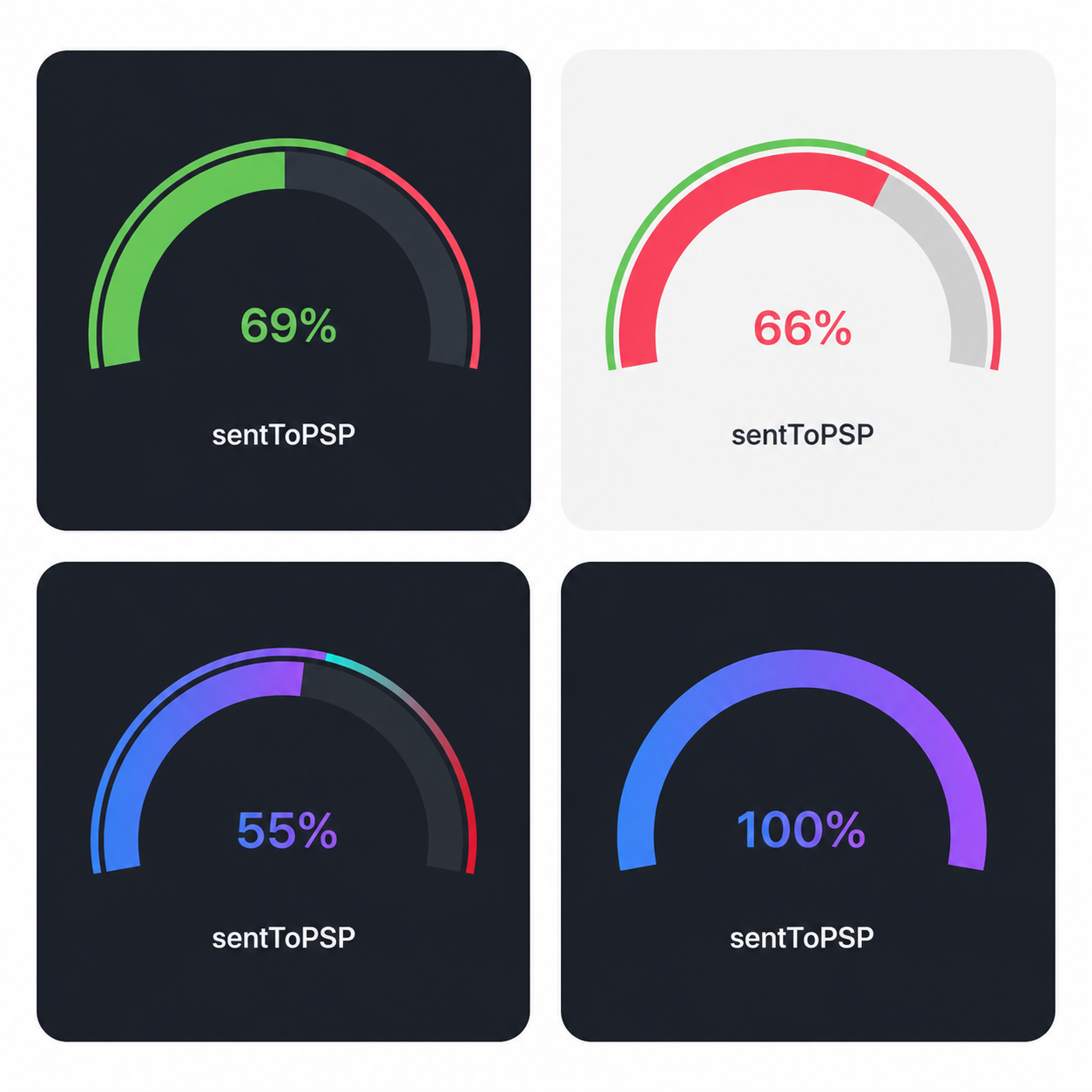
| `value` | `number` | `0` | Current gauge value |
| `maxValue` | `number` | `undefined` | Optional threshold value |
| `label` | `string` | `"success"` | Label shown below the gauge |
| `okColor` | `string` | `#79D56C` | Main color for normal state |
| `dangerColor` | `string` | `#FF6077` | Color used when `value > maxValue` |
| `trackColor` | `string` | `#2B3038` | Track/background arc color |
| `cardBg` | `string` | `#1C2027` | Card background color |
| `textColor` | `string` | `#FFFFFF` | Color of the central text |
| `width` | `number` | `220` | Card width |
| `height` | `number` | `180` | Card height |
| `animationDuration` | `number` | `700` | Animation duration in ms |
| `scale` | `number` | `1` | Scales the SVG gauge size |
| `startAngle` | `number` | `-90` | Starting angle of the arc in degrees |
| `endAngle` | `number` | `90` | Ending angle of the arc in degrees |
| `gradientColors` | `[string, string]` | `undefined` | Tuple for custom gradient fill |
---
## 🎨 Behavior & Customization
- **State Handling:**
- If `value <= maxValue`, the arc renders in `okColor` (or the `gradientColors` if provided).
- If `value > maxValue`, the arc automatically switches to `dangerColor` for visual emphasis.
- **Advanced Styling:**
- Use `startAngle` and `endAngle` to control the curvature of the gauge.
- Passing `gradientColors` will override the solid `okColor` for the value arc, creating a more modern look.
---
## 📄 License
MIT